on
Blog 1: Introduction
Hello! My name is June Park and I am a junior at the college studying Government on the data science track and this is the beginning of my blog for GOV 1347: Election Analytics.
Introduction:
This week, I focused on visualization customization of congressional races.
Map of Republican/Democrat Vote Share Margin by STATE (2016, 2018):
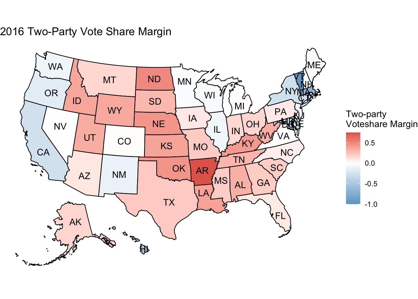
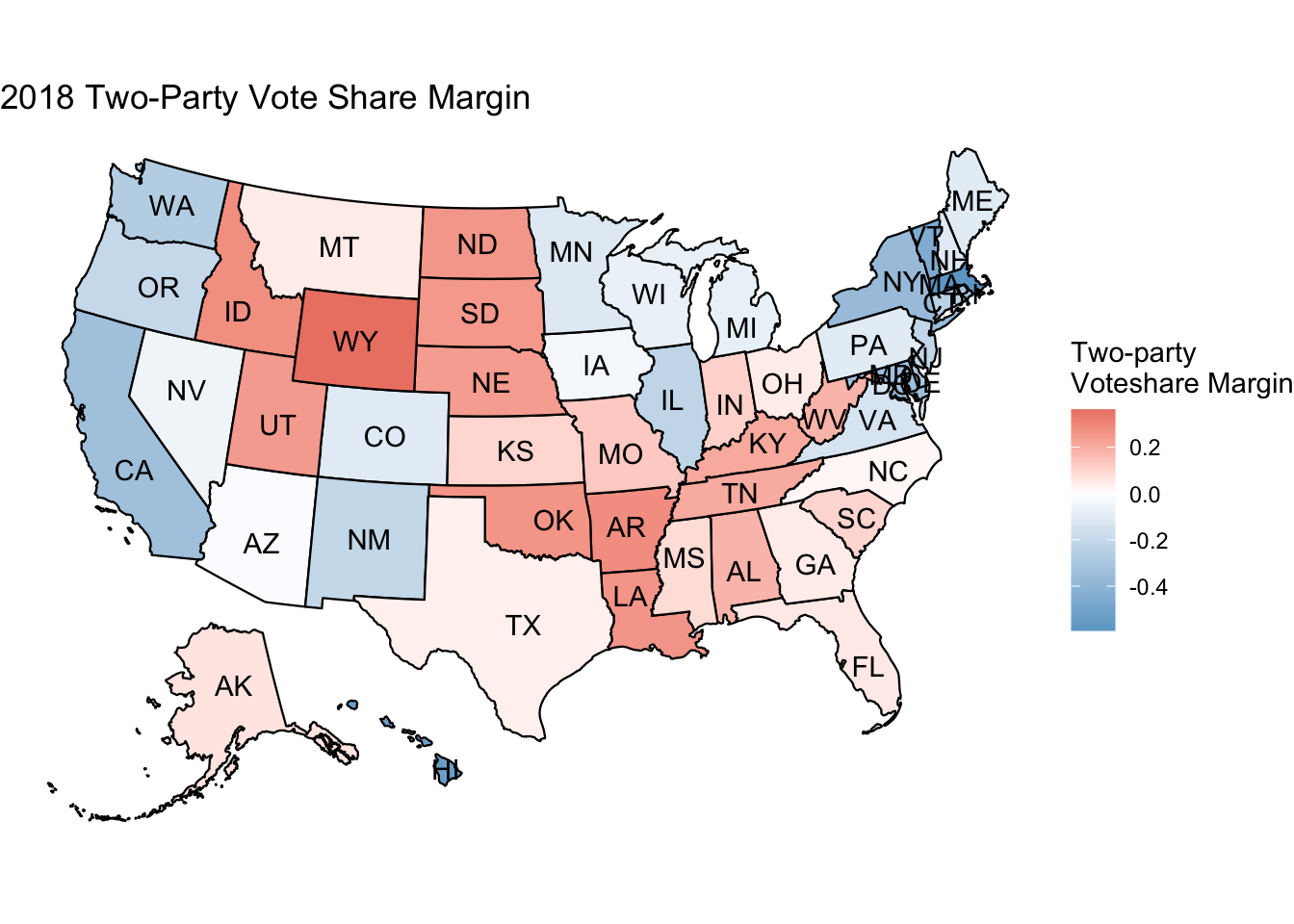
The first set of maps represent the two-party vote share margin in the 2016 and 2018 congressional elections. Vote share margin indicates the proportion of the difference between the Republican and Democratic vote share [(R-D) / (R+D)]. When the vote share margin is less than 0, this means that the majority of the votes went to the Democratic party; on the other hand, when the vote share margin is greater than 0, this means that the majority of the votes went to the Republican party. The greater the absolute value of the vote share margin (e.g., -0.4 or 0.4), the greater the difference in vote share margin between the two parties. For example, in the 2018 election, Pennsylvania had a vote share margin of -0.103, which indicates that the total Democratic vote share was about 10.3% more than the total Republican vote share. However, one caveat to note is that if the vote share margin is 1, this usually means that the candidates in the state ran unopposed, resulting in all of the votes going to the one party.
The map on the top represents the results of the 2016 congressional elections, while the map on the bottom represents the results of the 2018 congressional elections. Compared to the 2018 map, the 2016 map has more muted blue states, which indicates states with weaker margins of vote share for Democrats. The 2016 congressional elections coincided with the presidential election of Donald Trump where Republicans saw more victory nationwide. But in the 2018 map, we see many of the states that were muted blue become much deeper blue and even some muted red states turn blue, especially in the Midwest area. In 2018, a historic voter turnout for a midterm election, in what seemed like an ultimatum against Trump, flipped many congressional seats back to blue. For example, in the 2016 congressional elections, the majority of votes went to the Republicans in Pennsylvania, but in 2018 this pattern was reversed and the majority of votes went to the Democrats in Pennsylvania. As a result, the Pennsylvania Democrats gained an additional 3 congressional seats, while the Republicans lost 1 seat.
Map of Republican/Democrat Vote Share Margin by CONGRESSIONAL DISTRICT (2014):
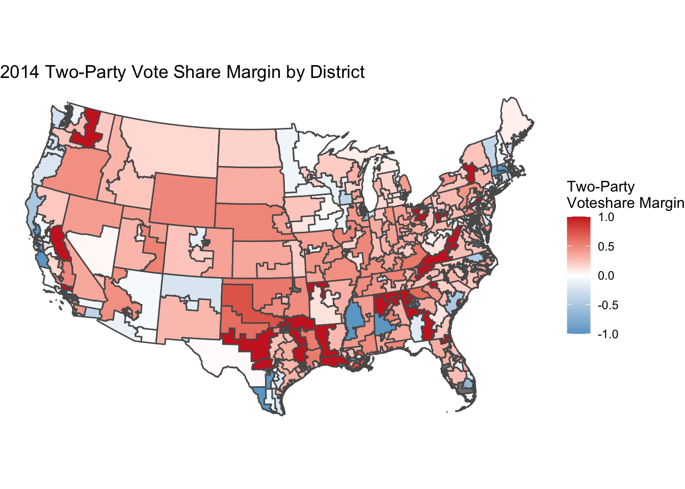 This map disaggregates the data so that one can examine the vote share margin at the congressional district level, which allows for more nuanced analysis than the previous maps simply at the state level. For example, in California, at the state-level it would usually be colored “blue” for a vote share margin favoring Democrats, but disaggregating the data to the congressional district level reveals districts where the Republican vote share was greater. In fact, at the state level, the Democratic total vote share was about 7% greater than the Republican total vote share. However, in California’s District 1, the Republican vote share was about 22% greater than the Democratic vote share.
These exercises have made me think about what is the best way to present data, especially election contestation. I look forward to using other outcome measures, like party seat change, on top of vote share margin in analyzing election results.